
01 SILK ROAD
Year
Scope
Team
2026
Brand Identity
Packaging Design
Art Direction
Nellie Olsson
Fiona Östlund (copy)
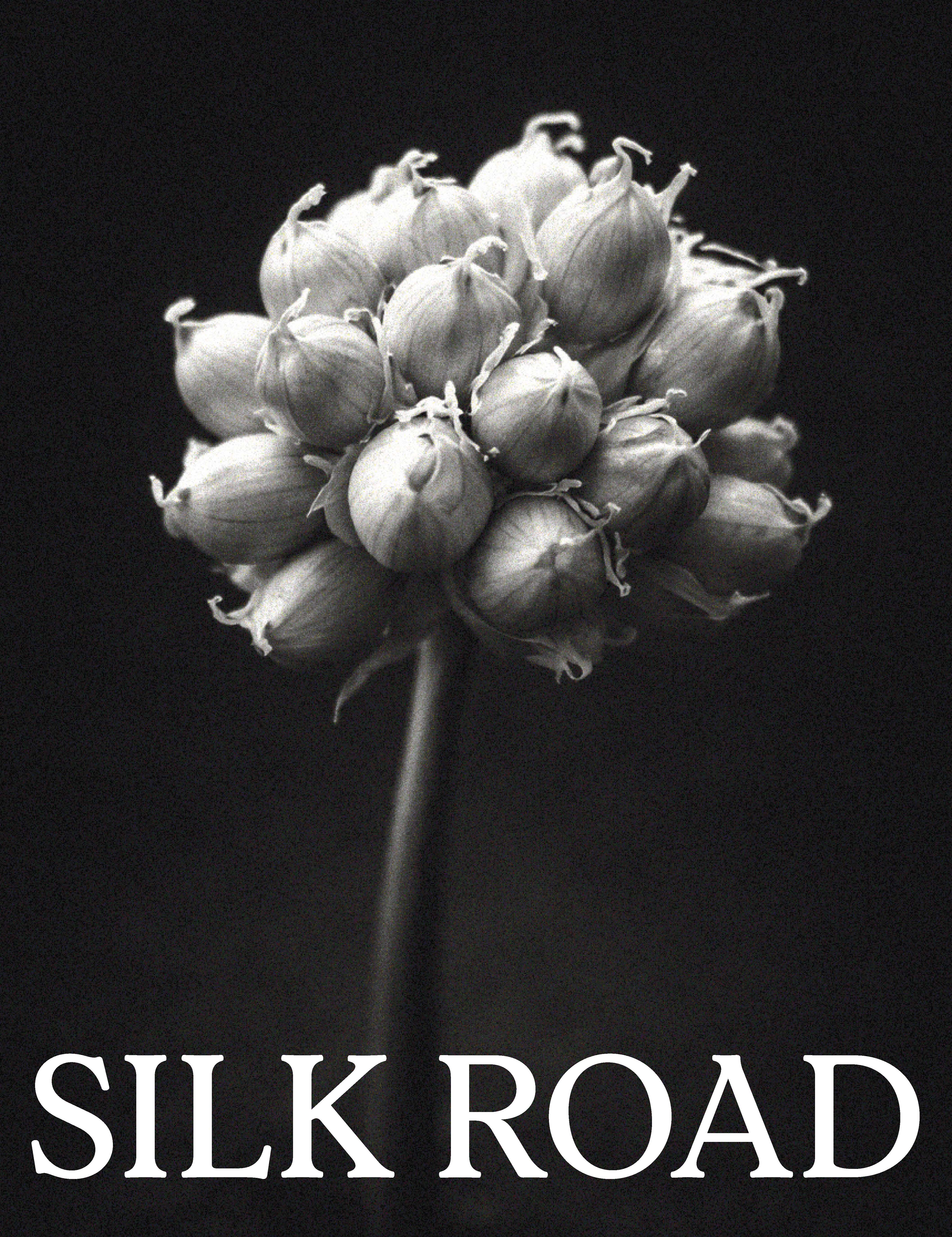
SILK ROAD reimagines pantry spices through an editorial and lifestyle-sinpired lens, allowing them to take their rightful place in the kitchen. No longer hidden away in cupboards, they become objects to live with, display and feel proud of.
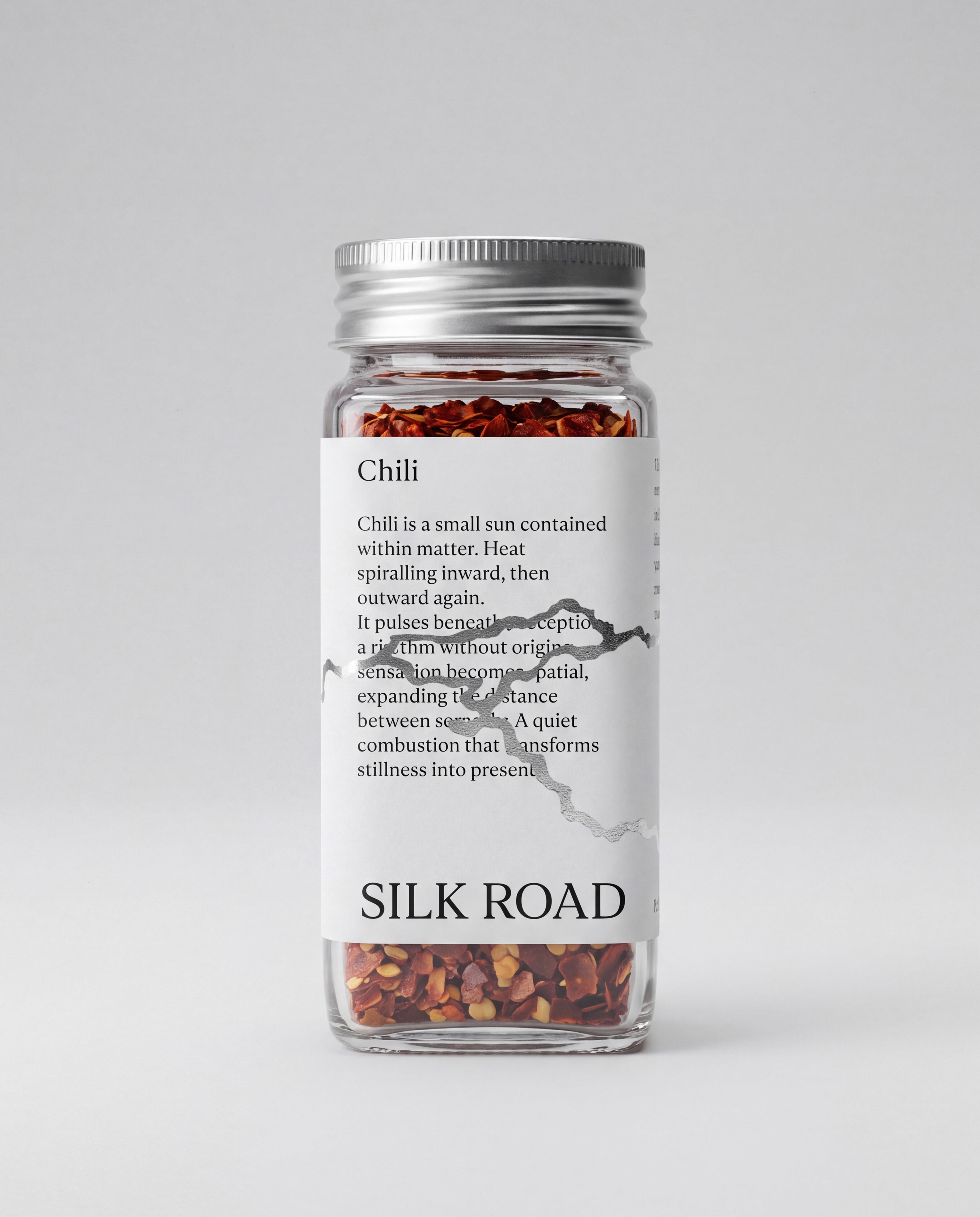
The brand name SILK ROAD draws inspiration from the historic trade routes through which spices travelled across regions and reached new parts of the world, connecting Asia, the Middle East, Africa, and Europe. This journey became a central part of the visual identity, translated into a graphic map of the Silk Road that runs across the labels and is finished in silver foil.
I chose the font Aska for its soft and expressive serif forms, which felt well suited to the poetic and romantic tone of the brand. Designed by Victoria Englund and Wille Larsson, the typeface adds a sense of warmth and character to the visual identity.






01 SILK ROAD
SILK ROAD reimagines pantry spices through an editorial and lifestyle-sinpired lens, allowing them to take their rightful place in the kitchen. No longer hidden away in cupboards, they become objects to live with, display and feel proud of.
The brand name SILK ROAD draws inspiration from the historic trade routes through which spices travelled across regions and reached new parts of the world, connecting Asia, the Middle East, Africa, and Europe. This journey became a central part of the visual identity, translated into a graphic map of the Silk Road that runs across the labels and is finished in silver foil.
I chose the font Aska for its soft and expressive serif forms, which felt well suited to the poetic and romantic tone of the brand. Designed by Victoria Englund and Wille Larsson, the typeface adds a sense of warmth and character to the visual identity.
Year
Scope
Team
2026
Brand Identity
Packaging Design
Art Direction
Nellie Olsson
Fiona Östlund (copy)